Covid-19 Dashboard
In 2020, I collaborated with David McCandless’s Information is Beautiful and Nueker to create a suite of interactive data visualisations for the COVID-19 Coronavirus Data Pack.
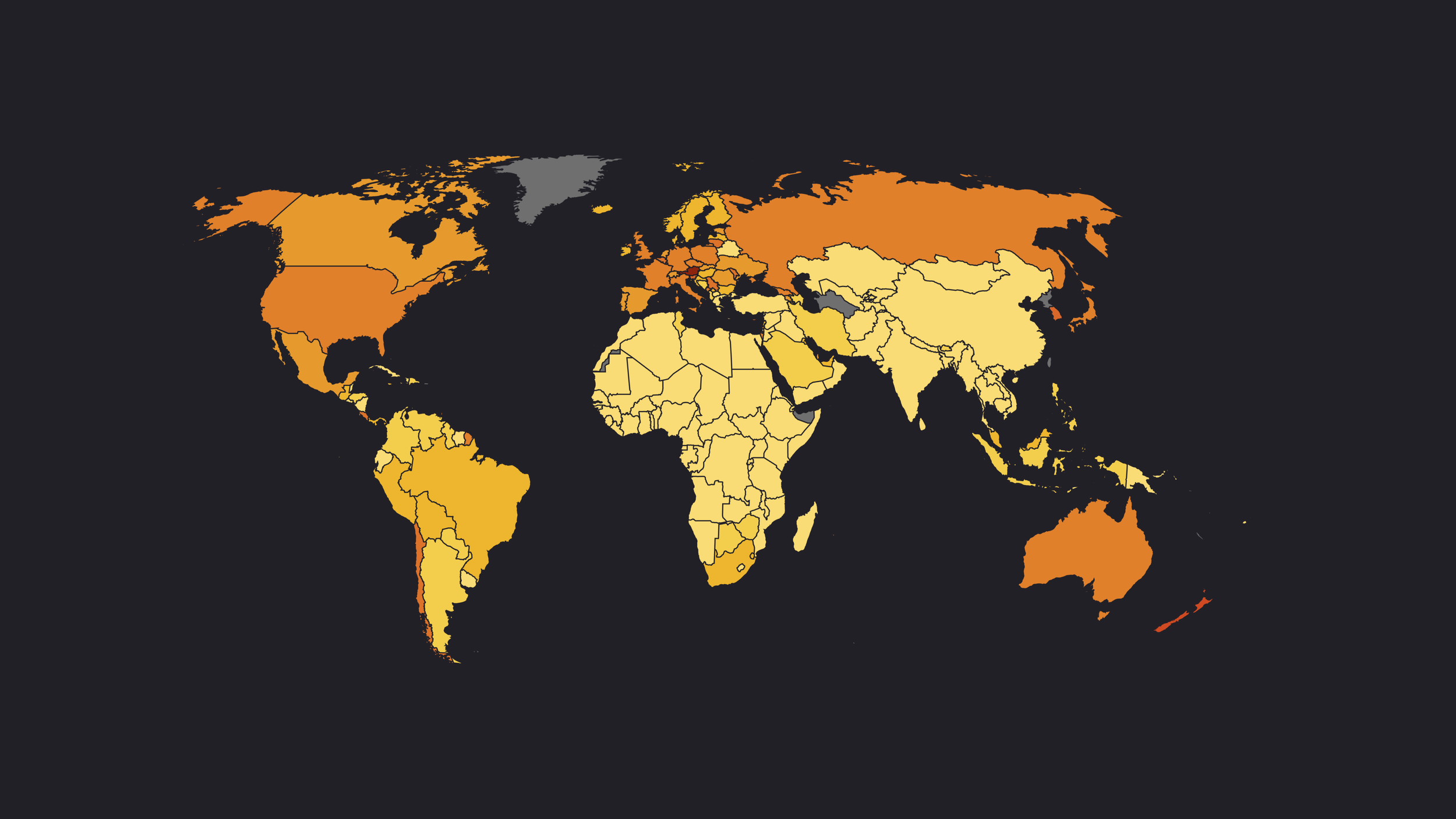
The COVID-19 Data Dashboard aggregated Johns Hopkins University data to highlight the most affected countries worldwide and enabled side-by-side comparisons of how different countries were responding to the pandemic. We also built a Global Vaccinations Tracker, updated daily, showing vaccination leaders and total doses administered globally.
View the project